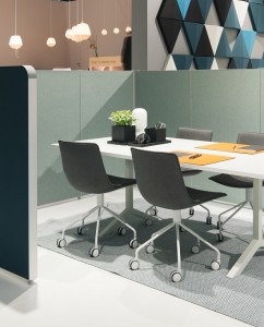
 A patient-centred home does not properly exist in most pharmacies because pharmacists have been building business models that relied on ever expanding retail sales.
In the process, “patient homes” were eliminated.
Older style pharmacies did not rely on enclosed rooms.
They simply relied on counters and quiet corners to have a chat in.
Because older style pharmacies relied on personal selling, the concept of “patient engagement” came naturally for those pharmacists who got involved in “counter prescribing”.
We were drilled by our master pharmacists to never mention the words “prescribing” or “diagnosing” – but that’s what we did – all day, every day!
And we always gave time to a patient on a “whatever it took” basis with no clock-limiting consultations – and it was all free.
No matter, the patients loved us and rewarded us with bucket-loads of primary health care requests, all resulting product recommendations being compounded or house branded – rarely nationally branded.
And the margins on these sales covered pharmacist costs!
But expanding PBS volumes (profitless prosperity) and supermarket style layouts have all but eradicated pharmacists and without a good result. Pharmacy leaders lost the plot for a long time with only recent moves indicating a sense of direction once more.
Hence my frequent reference to Aldi supermarket as a model in terms of their management style and marketing.
Their style would accommodate pharmacists in their own settings and is worth emulating.
Some modern suggestions for patient homes occur further along this article.
The pharmacy market was tightly controlled by the local pharmacists until we were taught the errors of our ways by the Trade Practices Act and the retail experts attached to supermarkets.
Pharmacy was encouraged to simply display and sell products like a supermarket so that we would not tie ourselves down with personally serving customers.
That was not a good thing because we were the expensive wage component of the pharmacy.
And indeed it succeeded. We became that way because we were no longer able to influence patient choices in the same way because national advertising ruled supreme.
Chemist Warehouse takes that to a successful extreme for their brand – but they are just one version of a pharmacy model.
Supermarkets have recently found that to dominate certain markets e.g. headache and pain; they need a qualified advice component.
That’s one reason they want to own pharmacies but without the pharmacists.
Again, the cost factor.
And suddenly our patients, except for the diehards, found themselves without a home.
The PBS system was also contributing to this displacement because the system offered initially a free consultation with the GP and free subsidised prescriptions at the pharmacy.
Why wouldn’t you go that way?
But still we had the “faithfuls” coming in regularly choosing to request recommendations from the pharmacist because he would see them without an appointment and without a fee, the compounded medication only representing a modest charge in those times.
And we never had complaints about a lack of privacy.
I am only going into the history of recent pharmacy because our market was manipulated by GP’s, government and supermarket comparisons and we never really got round to realising what was actually happening and we were learning how to adjust and make money with new models of pharmacy.
What we didn’t understand was the impact of mass marketing.
We didn’t understand that the more we sold of a branded product the more the manufacturer would move against you to break up your market share.
This because of the market pressure you could exert on his purchase price.
We didn’t understand space management and thought we could sell the same volume of merchandise from our small corner stores compared to the mega-supermarket.
We didn’t understand that manufacturers launched their products in pharmacies because they could get a higher price for their product through personal selling by pharmacy staff.
Very cheap launch costs for a manufacturer with a pharmacy bearing the full risk of a new product, that after demonstrating success, was much easier to sell to a supermarket with a level of demand in place already.
Okay, enough of the history lesson and how to get back to rebuilding a patient home.
Well the starting point is commitment. If you are not committed to expanding clinical services then stop reading now.
The next move is investment, so again, if you are not ready for a long-term funding of your clinical services, then stop reading at this point.
One business model could involve going into formal partnerships in different departments of a pharmacy.
This could become a new model paradigm able to introduce young pharmacists into part of a pharmacy partnership that they could actually afford, and to bring in clinical skills, capital and business drive that you, as a jaded proprietor, may no longer have.
Electronic cash registers and book keeping systems would facilitate such a process, not possible even a decade ago.
Part of this investment may also require building a compounding dispensary to provide the margins necessary to support pharmacists, as well as your own name brand, to prevent copying by competitors (including supermarkets).
It also requires documenting a pharmacopeia to coordinate and streamline pharmacist recommendations for patients, and the pharmacopeia should expand to become a body of knowledge (evidence) for all clinical products including branded products.
Fiddly work, but provides products difficult to discount by competitors and increases knowledge to a delegated group of staff pharmacists.
It will take a decade to firmly implant clinical services to once again become a visible segment of core business.
The market will be driven by the “worried well” and the aged care patient.
The “worried well” will be sufficiently cashed up to help subsidise part of aged care, but that direction should be fully supported by your own market plan.
As part of that market plan we are limiting our comments as to how to set up a patient home.
Patient homes (clinical spaces) need to be planned and allocated.
This may require taking space from some low turnover markets (cosmetics come to mind) and fitting out these spaces with distinctive and attractive furniture and fittings, with its own distinctive colour scheme and design.
The major clinical spaces need to be identified with a sign because community pharmacy is a business model segmented into departments, sections and products (packaged services can also be treated as products with caution, so as to avoid commoditisation).
Notice that we have designated clinical spaces (plural) because not every clinical activity can be fitted into an allocated space.
However, the objective would be to have a designer coordinate your spaces for harmonisation with all other pharmacy spaces.
Thought needs to be given here and it will be worth working with a good interior design person to achieve the desired effect (as distinct from a standard shopfitter design).
Good pharmacy designers are generally found in European countries, particularly Italy and the Scandinavian countries.
We have featured an Italian company for whole of pharmacy design and development (Sartoretto-Verna), but we now feature Abstracta, a company diversified through all Scandinavian countries and Finland. They concentrate on furniture and office panels and they offer some great designs.
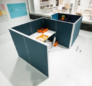
While you still need your enclosed room for very private conversations, eighty percent of pharmacy patients would prefer an open style engagement with a good level of soundproofing and general privacy.
The manufacturers claim to be able to insert visually attractive panels that make it easy to “carve out an oasis of tranquillity”.
This emulates the old-fashioned model and good design, separates the space from the “toilet paper and toothpaste”.
All, furnishings need to be visually attractive and comfortable enough for a long appointment time.
You don’t want patients leaving because the furniture hurts them – and they are less likely to return if that is the case.
Study the ergonomics required and make sure it appears in your patient home design e.g. good arm-rests for those patients who may have sore joints or walking difficulties-so they can get out of the chair with minimal pain.
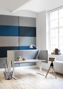
Abstracta knows a thing or two about workplaces, which is why they’ve teamed up with Stefan Borselius to create a visually appealing sound-absorbent screen that makes it possible to get some privacy even in the busiest of retail environments.
It’s called Domo and it’s well worth a look if you struggle to carve out some peace and quiet for yourself in the day.
Abstracta is fully aware of the challenges that face the modern worker:
As the information flow has increased, there is less room for peace and quiet. Consequently, there is a great need today for undisturbed spaces at our workplaces. Spaces that enable us to work without our thought process being constantly interrupted, stealing both time and energy
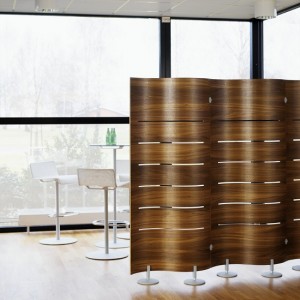
Designed with bevelled edges, the screens interact with light and shadow to ensure that visual appeal isn’t completely overshadowed by function. Domo offers other options as well, like rounded or straight corners, different colours for the inside and outside of the screen, and various functional storage solutions that attach using a magnetic bearing strip.
Borselius explains that his design choices tried to combine the best of both worlds:
I’ve applied the furniture industry’s principle of rounded corners to give Domo a visual expression all its own. But the aim isn’t just aesthetic, it’s also functional. The screens can easily be combined and joined without using brackets, which might otherwise compromise the overall impression.
Some people see hustle and bustle as an accepted part of life, but for others, the importance of peace and quiet can be hard to put into words.
The soundscape is not visible, but it affects us more than we think. Sound makes us experience some places as stressful, and others as harmonious and open.
For more information about Domo, make sure to get in touch with Abstracta.
http://abstracta.se/contact-us/
Panels provide privacy and sound absorption but other office elements need to be considered.
The above arrangement would suit most pharmacies with minimal cost.
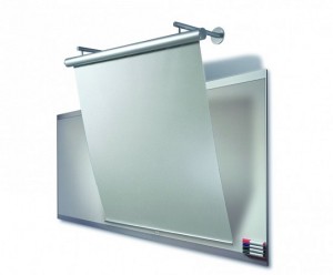
There are other additions that could be considered, one being a wall-mounted sound absorbent projection screen.
This would enable the above space to be scaled up to allow group consultations (a method of patient education for patients with very similar conditions and who require education that can be shared (to keep patient fees to a minimum).
The image below illustrates the concept:
SilverPipe screen – design Friis & Moltke design MAA MDD BDA.
The screen is operated eigther manually, by crank handle or electrically with a low noice motor. Tube in matt anodized aluminium with screen for ceiling or wall mounting. The bottom roller is equipped with magnets so the screen can hang in a tilted position. Available in different sizes.
De Luxe screen, gain 1.1 –
The screen is made from flameproof coated fabric, mounted inside a white coloured aluminium outer case. It can be installed either in on wall or in the ceiling.
Available in different sizes and available in Australia.
Check out the Abstracta catalogue and visualise what is possible.
http://abstracta.se/office/
Check out the link below to learn about noise suppression.
http://issuu.com/benjick/docs/abstracta-akustikguiden-2013-148-21?e=3073569/4971690
All the graphics in this article are ideas to contribute to your own patient-centred home.

