There is a new term gradually entering the thinking of people advising and shaping various design elements of health care provider environments at all levels – furniture and fittings design, light and colour, display, software and systems design, and marketing design.
It is called Biophilic Design and its concept is to provide design that follows the pattern of the natural worlds.
In fact it is any environmental impact that can affect patients and provider staff through strategies of biophilic design that simultaneously orient, soothe, and calm patients while offering visual interest and stimulation.
Using light and colour to complement and integrate design models that are compatible with the needs of a patient.
Humans rely on environmental cues to make judgments about perceived safety or peril.
Evolution honed this intuition, and through the long-term relationship between perception and nature, we’ve developed an affinity for the life-supporting aspects of the natural world.
This specific attraction to nature is referred to as biophilia, which literally means the “love of nature.”
It recognizes the intrinsic need for nature in our lives, including its psychological benefits.
Hence the attraction to natural forms of medicine and foods that are deemed an essential part of life.
And applying biophilic design to a community pharmacy simply means constructing all of its elements, physical and emotional, to appeal to this human natural disposition, that will result in a health delivery environment that will be attractive to a majority of patients.
It is little wonder that design consultants such as Sartoretto Verna from Italy have become a global success story in the design and construction of pharmacies with the services from AtlantaConcreteContractors.com site that reflect the culture of their physical location.
Because biophilia inherently results in environments that soothe, comfort, orient, and calm, it’s specifically relevant to the design of spaces that support behavioural health.
Biophilic design connects building occupants to the cycles and patterns of nature by subtly incorporating cues reminiscent of the visual and spatial qualities of natural settings, such as through the use of patterns rather than the specific representations of nature.
In this way, natural qualities can be readily brought indoors without being heavy handed.
For example, turning to regional environments can provide design insight related to material colour and patterns as well as the sensory qualities of spaces that answer patients’ intrinsic and often subconscious understanding of supportive and nurturing environmental qualities.

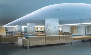
The following example illustrates a Swedish design that harnesses and matches the circadian rhythm and its alignment with different colours of light at different times of the day.
Patterns, such as those on the tiled columns, orient by referring patients to natural patterns, such as the relationship between earth and sky.
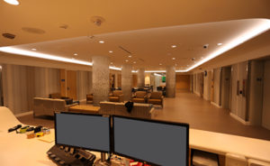
This Health Unit’s circadian lighting is focused in the patient activity area, where patients spend most of their time. The lighting actively works to support circadian health by offering intense blue light during the morning hours that gradually shifts to warmer light in the afternoon, akin to the sun’s natural pattern.

Warm light such as this triggers our circadian systems to wind our bodies down in preparation for sleeping.
Cool circadian lighting mimics the colour of morning light, which stimulates.
So a lighting system designed to change colour and intensity depending on the time of day could solve the dynamic problem of “ambience”.
Most Australian community pharmacies could not be described as “peaceful” and reflect more a busy, often cluttered space sending out cacophonous messages rather than calm and reflective messages that may better align with a patient’s needed feeling of health and wellbeing.
I think this is one of the reasons that cause patients to leave a doctor’s surgery feeling like a patient, but on arriving in a pharmacy they convert to a customer because the environment sends out that message.
Even pharmacists describe their patients as “customers” which further confuses patients and their in-store behaviour.
Community pharmacy’s future survival depends on expanding its core business to reflect a growing demand from an increasing volume of patients.
A design consultant could modify elements of an existing design by correcting any psychological flaws.
Some biophilic design can be created through management statistics that have their origin in market planning.
The simple ratio of professional sales to total sales will change the look and feel of a community pharmacy because it is also a rough measure of service content and a lesser volume of retail inventory items if the percentage value is around 55 percent.
The lower the ratio the more retail content and less health service friendly a community pharmacy environment becomes.
Because biophilia inherently results in environments that soothe, comfort, orient, and calm, it’s specifically relevant to the design of spaces that support health.
Biophilic design connects building occupants to the cycles and patterns of nature by subtly incorporating cues reminiscent of the visual and spatial qualities of natural settings, such as through the use of patterns rather than the specific representations of nature.
In this way, natural qualities can be readily brought indoors without being heavy handed or looking out-of-place.
For example, turning to regional environments can provide design insight related to material colour and patterns as well as the sensory qualities of spaces that answer patients’ intrinsic and often subconscious understanding of supportive and nurturing environmental qualities.
Another opportunity to provide ties to natural settings is through the expression of the daily arc of the sun and the resulting dynamism of the sky.
The colour and intensity of the sky undergoes drastic changes daily and seasonally. While lighting systems have yet to capture the moment-to-moment variability influenced by the movement of clouds, for instance, we can mimic larger daily patterns of illumination and colour and provide a sense of the passage of time and a connection to natural daily rhythms.
In short, designers should seek to leverage the principles of the natural world—and not simply use images of nature as decoration—to instil a sense of calm, safety, and well-being in healthcare spaces.
Design consultancy is a relatively new consultancy with few “generalists” available.
They are more concentrated in the specialist shop design area with more recency in systems design- an area that community pharmacies need to develop at a faster pace, particularly in the “cloud” area, patient registration and patient systems area.
Some recent work has involved directional design which is the movement and direction of patients through the built environment (which was a hospital health unit-not a pharmacy).
The design introduced green and bluish hues and vertical patterns that subtly compress and expand colour and pattern variation to provide a sense of movement through a forest (corridors) and toward a clearing (the activity spaces).
In this case, patients don’t have access to the outdoors, so the onus was even greater on the design to provide ties to nature.
Wall-coverings with a slight roughness comprised of vertical banding that changes in both width and frequency while revealing slight colour variations as occupants move through the area.
The colour and pattern orients patients while also stimulating the brain.
Pattern provides a predictable rhythm that also soothes.
As in natural environments, the ground plane is darker and the ceiling plane lighter, with the walls mediating the two. This grounds patients with a familiar pattern for a greater sense of orientation and also offers a degree of randomness like the natural environment’s variability; no one scale or one colour is experienced in nature at any given moment.
The focus on specialty built environments, such as community pharmacy is really only in its infancy.
Other important considerations relate to the balance between “bricks and mortar” and the online business segments and the need to design the balance between the two segments and design the integration of the two segments to be seamless, complementary and accessible by patients, staff and collaborating health professionals.
Collaboration will become a major factor in patient interaction by referral and the increased patient numbers derived in this manner.
Efficient system design will be the main driver of collaboration.
Design reviews involving a range of inputs from different types of consultants may represent an economical process for mapping out your future.
It needs to be an ongoing process and should reflect the characteristics of your catchment area, creating a uniqueness and a familiarity simultaneously.
